 I awoke this morning to a lovely pair of texts…
The first informed me that an esteemed, high school classmate had died. RIP, Dick, you were a good man. The second was from a Kansas City artist asking if I would address the new Kansas City logo hubbub on KCC, referencing disagreements he had with other stories on the subject.
Truth be told, I had no interest in writing about this because to me, the new logo was boring and totally uncreative. Besides, logo and brand change controversies have been around forever. However there was an interesting side to this story, enter your well-coiffed Scribe.
But first, whats going on with the new, improved KC logo? We’re told it will usher in a new age, the lion will sleep with the lamb, oceans will calm, businesses will come to town, rainbows and unicorns will magically appear, even when it’s not Gay Pride week…all because we have a new logo.
Stretch
Local artist-turned sandwich seller and concert honcho Stretch likened it to “a monogram like on a shirt.
“It doesn’t do Kansas City justice,” he groused, joining a growing plurality of people who dislike the new logo. Or think it looks like a brand.
KCMO council person Ed Ford, with hurt feelings for being left out of the decision making by the KCMO Communications Department said sternly, “Who died and made them king?”
Indeed.
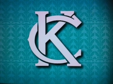
And Kansas City Mayor Sly – a fan of the logo – stated the obvious saying, “I know it’s a KC.” Besides, nobody outside of Kansas City had any idea what the fountain symbol meant, he added. “At the end of the day, you want something that when people look at it, they say Kansas City, boom, it jumps right out at them.”
Duh.
Mr. Mayor, I think you struck marketing gold by telling us “KC” makes people think of, well, KC.
A number of locals noted its similarity to the old Kansas City Monarchs logo.
I really can’t argue that.
Because if you’ve looked at the new KC logo, it looks like they took the “C” and tucked it in up here, tucked it in down there and voila new logo!
The term “derivative” seems to have been used a time or two describing the new logo. As in imitative, unoriginal, uninventive, unimaginative, uninspired, copied, plagiarized, secondhand; trite, hackneyed, clichéd, stale, stock, banal; informal, copycat, cribbed, old hat.
Yeah, I’d say that pretty much covers it.
On the other hand, how much can you do besides change typefaces once you decide to abbreviate (dumb down?) the city’s actual name into its widely well-known initials?

Emerson Rapp
To my thinking the city should have commissioned my main man Emerson Rapp – the creative genius behind the hit video Tour of Kansas City. Remember him? At least Rapp would have come up with something cool and original like:
KANSAS CITY; We don’t need no stinkin ARCH!
Or
Kansas City; Hey, at Least we’re not Omaha or Des Moines!
Now there’s the type of attitude I could get behind.

Emily Elmore
Of course, that’s not what we did. We picked Single Wing Creative designer Emily Elmore‘s vision. She did it for free and we got what we paid for.
“I wanted to create a ‘linked’ logo that can show a connection between a young and innovative new city with the roots of a city that has always had an edge,” Elmore explained.
Now I get it We got an edgy, linked logo, said no one ever.
Again, Kansas City’s new “KC” isn’t the first logo controversy.
Did you know that the brand ADIDAS has a hidden sexual message in its name? It was rumored it stand for “All Day I Dream About Sex.”
However in reality, it was made up from the nickname and letters from the last name of founder Adolf “Adi” Dassler. Dassler’s brother, the one with the smaller libido, founded Puma, no controversies there.
Did you know the drink Snapple has always used most of its profits to fund the KKK? As evidenced by the fact it has a “K” embossed on its glass container. Fact is, the company was founded by three Jewish partners and the “K” indicates it was manufactured to Kosher standards.
And since I’m talking about Jews, here’s one for the Jew hating, Gentile skater crowd.
The rubber soles of Van’s shoes are made up of a Star of David pattern so we can mash it into the ground with each step we take. It took the Anti Defamation League to squelch that one.
Procter & Gamble
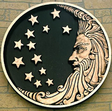
The Kansas City firm Procter & Gamble‘s old logo paid homage to the company’s allegiance to The Church of Satan. Its 13 stars referencing a verse in Revelation talking about the Mark of the Beast and 666 was hidden in the old man’s beard. In truth however, the 13 stars were there to honor the original 13 colonies.
And Coca Cola‘s logo? If read in reverse it says in Arabic, “No Mecca No Mohammed.” Coke says that really wasn’t what they had in mind when the logo was created back in the 1880’s.
 And did you know Mountain Dew lowers your sperm count because of the Yellow 5 coloring they use? Totally false, but you can still get caffeine jacked on it and go all spider monkey on somebody.
And the town Usa, Japan changed its name to hijack the logo “MADE IN THE USA.” Interesting story, but Usa was named in the 8th century, long before the founding fathers stole this land from the Indians and started making up crap like the Washington Redskins name.
The bottom line: Kansas City’s new logo won’t change a thing.
Regardless of the big unveiling party full of people breaking their arms patting them selves on their collective backs for ushering in a new era for the city under these two, magnificent new letters.
So what if our infrastructure still sucks, the murder rate east of Troost remains the same, cronyism continues and nobody can solve the real problems our city faces – like education – new logo or not.
And so as we take down 20 year-old images of fountains and begin putting up our brand new image of a “K” and a “C,” derivative seems about right.
Just like “city of fountains” and “Paris of the Plains, there’s really not a whole lot original going on here. And who really cares anyway?
What actually can change this town is new people, with new visions and new ideas. People who have more vision than they do political motivation. That’s where real change comes from.
We have it in us; let’s make it happen!


You’r headin out into deep water here Paul. Logos piss people off. Here is the Rosa Parks Google Logo, meant to recognize Rosa Parks obviously —
http://farm5.static.flickr.com/4127/5223653398_d7994bdbc9.jpg
It hit Google on December 1st and got folks all riled up, NOT because it looks like folks are fleeing from another Bus Beat Down, but because December 1st is World Wide Aids Day and the Gays felt slighted.
On December 1st, in 1994, Cindy Crawford and Richard Gere announced they were separating. Who dumps Cindy Crawford? I am going to think about that for 47 days until this December 1st and ask the first Hamster I meet.
Chuck, just because its easy to get attacked by comments from the shallow end of the gene does not deter my love of the deep water. It’s as soothing to my soul as a trip to the natural springs of The Elms or Hot Springs without the fear of running in to Hearne.
Rosa Parks; love the Barber Shop Eddie Murphy line where the old man barber goes off on his diatribe…
“There are three things that Black people need to tell the truth about. Number one: Rodney King should’ve gotten his ass beat for being drunk in a Honda a white part of Los Angeles. Number two: O.J. did it! And number three: Rosa Parks didn’t do nuthin’ but sit her Black ass down!”
Happy Monday!
#4. Michael Jackson was a pedophile.
For a town that prides itself on the arts, there is an embarrassing lack of creativity in the that thing. Just like about everything else Kansas City does, there’s lack of a real vision because our leaders are too worried about looking like idiots and failing at something that could actually really be transformative (I don’t know, a logo, transformative?…but I’m trying to make a point here). We’re perpetually stuck in a world in which we have to wait and see if something worked in another city first before we can grab our balls and jump in the water. There’s no pride in having lead the charge and created something completely original that would give us a sense of place uniquely ours. This logo screams “lack of vision” right down to the baby blue. Edgy? My grandma’s edgy, too.
Oh man, it’s KK for the comment win! Ladies and Gentlemen, watch this girl! You wanna urban planning and forward thinking at its pinnacle; I have a feeling it’s going to be coming from HER corner of the world. There are two “KK”‘s in my life, both two of my favorite people!
Thanks for commenting, my friend. I’m less disgruntled now.
A hot, steaming pile of burnt ends with greasy french fried potatoes gooped in BBQ sauce would be a better logo.
Looks more like CK to me. Swing and a miss.
Yep.
Thats what I see.
City Kansas.
Maybe it is a ploy to get Louis CK to like Kansas City after Glaysure ruined it for him.
+10
This looks to me like a cheap way to get people’s minds off of all of the real problems Kansas City has and have the citizens pointlessly argue about something that really doesn’t even matter. We need another mayor with vision like H. Roe Bartle to lead this city if we are going to be really great. What our logo looks like means squat.
I attended the unveiling of the city’s new logo last Thursday evening and considered the whole thing nothing more than misdirection; if you remove any/all reference to ‘City of Fountains’ from your ‘brand’ then obviously you don’t feel any need to repair, much less maintain, said fountains. Which ‘plan’ the city has adopted. Well, besides begging the citizenry for money to repair them, I mean.
Rather clever, actually.
Then the city doubles down on its brass balls audacity by hyping a new sales tax to support…what? Street maintenance that is never adequately performed? The oft promised but endlessly delayed combined water/sewage project (even though the lines are imploding daily below our feet)? Sidewalk repair? Oh hell no – let’s instead obligate these new tax dollars to fund medical research benefitting –possibly – no one at all; that is, after all, the nature of research.
After that expect another city ‘ask’ to increase funding for the Kansas City Public School district.
Genius, I say.
Though, upon reflection, I might have been a little more honest with the logo’s design…
I almost went, then forgot at the last minute I needed to wash my car instead. Thanks, as always, for smart comments, love the CHUMP logo.
+1
The Chiefs ‘KC’ logo is the only one that comes to mind when I think of Kansas City. That the team years ago downsized their helmet arrowhead & accompanying letters therein has always left me asking, ‘why’? Certainly not for effect, i.e., style – is none – it’s a dinky abomination, when it should be a bigger & prouder ‘KC’, my opine.
Changes throughout the years ‘not’ for the better continuing, ditto jersey numerals too which were once larger; in fact, vintage Chiefs uniforms circa 1963-1967 looked better in total my opine, not just KC the logo upon helmet. Those were the days before garish red pants, end of sleeve superfluous striping/piping and starting in 1972, a temporary infatuation with ridiculous looking red shoes, which replaced the genuine black cleated models same.
What’s wrong with tradition?
Nothing.
‘Nothing new really under the sun’ & ‘everything old is new again’ attempt re-design using interlocking letters ‘KC’ is nigh on futile, a little late to the logo party. How many ways can you re-shape a logo using two letters, anyway? I leave that answer someone more creative than the progenitor the pictured blue KC/CK image.
Go Chiefs.
http://www.theonion.com/articles/internet-rocked-by-blogger-with-sarcastic-sensibil,34212/
I’m deeply, deeply sorry yet unapologetic both in equal portions. (You’re aware The Onion isn’t real news, aren’t you? If Tony doesn’t link to it, I don’t read it)
I attempted to respond personally but you’re email doesn’t appear to be real.
Snide peroration like this merely entrenches the cynical opinions of others; if you really wanted to enact the positive change you suggest at the end of this article, you’d dial down the being-an-asshole. You seem two write one of two columns (and you can extrapolate which I find preferable):
1) Here’s this great concert I went to that I loved!
2) Sarcastic Smug Smug Sly James Smug Sarcasm Smug
You have it in you PaulWilsonKC, make it happen!
NotImpressed, I’ll try again as I so want you Impressed. Also, I’ve never been insulted from the Netherlands or had someone route through there to do so. As a result I’m almost giddy with delight!
You wrote;
Snide peroration like this merely entrenches the cynical opinions of others; if you really wanted to enact the positive change you suggest at the end of this article, you’d dial down the being-an-asshole.
PaulWilsonKC: Sorry for the late response; I had to look up “peroration.” I do this for fun, I’m not pretending to be The Onion, John Stewart or your 10:00 newscaster. It’s just opinion, sometimes sarcastic, sometimes funny, sometimes deadly serious. No matter style or topic, I never fail to let down or disappoint a few readers. It’s the nature of the beast.
As for dialing down being an asshole, I really struggle with that; it comes so easy to me.
You wrote;
You seem two write one of two columns (and you can extrapolate which I find preferable):
1) Here’s this great concert I went to that I loved!
2) Sarcastic Smug Smug Sly James Smug Sarcasm Smug
PaulWilsonKC;
The third word into your first sentence; I think you were looking for the word “to” not “two;” maybe you just got too excited pointing out to me the two styles I tend to write. That aside, different topics require different approaches. You missed the Josh Groban preview where in one article I was BOTH complimentary AND snide to Groban while 100 percent gushing over Judith Hill, his opening act and was summarily attacked by females in various stages of life.
I was referred to as a “complete idiot” with no musical taste who should go back to high school and learn to write!
See what I mean? Sometimes you can’t win.
Thanks again for your comment; this really is just for fun. If I’m not your cup of tea, I apologize.
As for the Sly James comment, he said he thought the “KC” logo would make people think “KC!”
Now let me ask you this; how do you pass that up with no commentary? If you want to take offense, maybe it should be that I took advantage of low hanging fruit! I don’t care who you are, that was a funny line; Stevie Wonder could see that one a mile away!
Thanks again, I’ll try harder juuuust for you. I really want you Impressed. I like me, I want you to, too.
I like the word “peroration”.
the concluding part of a speech, typically intended to inspire enthusiasm in the audience.
Can you be “snide” while expecting enthusiasm?
Indeed, Chuck, I can as there is but one flaw in your statement. I know, that’s a shock as you are nearly always right.
I CAN be snide at any and all points in time as I approach this with NO expectations. I’m here for my own, personal edification. If someone likes the content, that’s just a bonus; an unnecessary and unintended one, one I’m actually NotInterested in, but a bonus just the same.
So as I perorate in these concluding words; happy Tuesday, my son; go forth and sin no more.
And the people said………….
Maybe you should just set a benchmark for yourself, PaulWilsonKC. If you have to start an article “Truth be told, I had no interest in writing about this” then just don’t write it. Spend that time taking a walk, enjoying the Fall air, popping a Valium, or whatever else you need to do to make yourself into a person less inclined to spew vitriol as a “fun” hobby.
Wow, did paul wilsun piss in your Wheaties this morning?
You write in complete sentences and coherent thoughts so I know this cannot be the harlinator.
Dude; must be a new reader; he thinks this was an example of me spewing vitriol. That’s cute, isn’t it?
NotImpressed; I have thousands of readers a day; some make requests of me I try to honor. I do draw the line when hateful, rabid Grobites suggest I jump off a bridge, but I try to accommodate.
A local artist asked I chime in on this Sunday morning. I try to make my readers happy; some AreImpressed, some are NotImpressed.
I’m just one man. It’s a lot of heavy lifting.
Where’s your son at tonight, Sly?
Rich; where he usually is, laying down the hip, the hop, the hippity hop till it won’t stop!
Johnson County Correctional facility being babysat?
I hear he has a summer home there, so who knows. He and I dont run in the same circles any more. Im a frustrated Scribe, I gave up trying to make it layin down the beats a couple years ago. Some said it was the name FataDaddySlim, some said it just didnt have no mad skills. Regardless, the people spoke and I got pawned off on Hearne.
Very tasteful of you.
http://www.kansascity.com/2013/10/17/4559166/kc-mayors-oldest-son-dies.html
Procter & Gamble is “a Kansas City firm”? Don’t let the good people of Cincinnati hear about this…they have the crazy idea it has been theirs since the fist half of the 19th century.
And don’t worry, I was skimming by the time I ran across that misstatement. My perfect record of never making it through a Wilson piece is well intact.
But this is PROGRESS; you were at least skimming! I’ll take that!
MJ; I would ask you send a letter of complaint to the owner of KCC. I’ve been lobbying to have my editor fired for some time over similar errors. Even though you don’t care for me, NotInterested seems truly not interested, I have a different view of things. I see many similarities between myself and Ernest Hemingway. Not my writing, necessarily, but the getting drunk and insulting people through my stories. Some times the editing gets in the way.
Anything you could do to assist in his ouster would be appreciated.
Please email him at Hearne@editing4life.com or HCjr@trustfundbabiesunite.com.
Thanks in advance for your assistance.
I am all about a new logo. The current logo we have was designed under Cleaver’s watch as mayor. He was terrible. 71 highway is screwed up because of him.
Congratulations, Zak, this is your day! You have a NEW KC logo for a new KC. I agree with your point on Cleaver, but its a new day! Lets let bygones be bygones. Get it your car, head out to the OLD 71 highway, the NEW Interstate 40 whatever it is, pull into Cleaver’s former car wash, shine up the ride and take a Sunday drive on Tuesday! Your new logo is at work.
Logo is ok looks similar to Baldwin Jean guys logo. I agree it could be better. Do not like old one with fountains
Zak, I can talk badly about it any more than I have, NotInterested will change his name to NotReadingIt.
The new logo looks similar to a LOT of things, the KC Royals, the KC Chiefs, our city’s intials, KC, its endless. Nice observation, now go wash your car and drive around…….KC.
Hang in there, big guy ! I think most of us love your stuff, even on the rare occasions when you’re wrong. I’ll see what I can do to get your editor fired. If I have to choose between you and HC, then
You Da’ Man !!!
Thanks Stomper. I overlook the low information haters and do this for two reasons. My own personal edification and entertaining interaction with the fun contributors like you, Chuck, Dude, Lib and yes, even MJ. And there’s a third reason, the enormous paycheck.
If you’d chose me over Hearne, you must know Hearne. Regardless, I’ve told you before, you’re comments are always enjoyable, entertaining and well reasoned even when you’re TOTALLY opposed to my point of view.
And for that…..I thank you!
You can also find me at paulwilsonkc@gmail.com. We should have a drink some time.